

Once upon a time, I wrote a game.
If you haven't played System's Twilight, these scans won't mean much to you. But if you have, you might be interested in looking through my original design notes and sketches. I did nearly all of the work on paper -- I mean, sketching stuff on graph paper with a bunch of colored pens, because it was 1993. And I kept all of the paper, because why not?
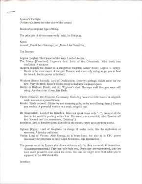
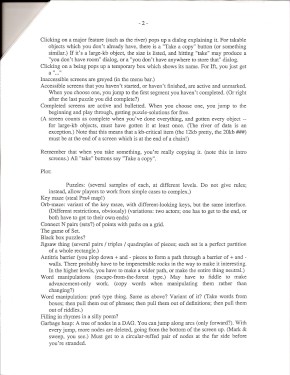
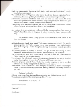
First up: my design notes. I usually (and to this day) start a game by writing a file like this -- just ideas about setting, story, mechanics, and puzzles. They all affect each other, so they all show up mixed together like this.
I don't think I have this document as a text file any more. Or, maybe I do, but it's on the hard drive on my old Mac Centris which I haven't booted up in twenty years. You'll have to read JPEG, if you can.
Here are the first four pages of the game script. It begins with an outline, listing every room and what happens there. It includes the requirements of what you need to get past every plot gate. So I could look over these two-and-a-half pages and mentally verify that the game structure was sound.
Note that I refer to the ten NPCs with single letters, because they all have different initials. This was on purpose!
The third page goes on to the script, which is all the text that appears in the story itself. First the introductory narration, and then (page 4) the scripts for the first three rooms. I haven't scanned beyond this point, but of course there's another twenty pages of this stuff.
This diagram shows the same gating requirements as the outline. Dotted arrows connect (logical) keys to gates. Circled initials indicate the first time you meet each NPC.
This is fine as a map, but it doesn't really make the structure any easier to verify, does it? It turns out that plot diagrams are not much help in game design. I know everybody draws them anyway, but I don't think diagrams give you any leverage on designing a more complicated game than you could with a simple text outline. This is why, for Hadean Lands, I had to write a plot requirement verifier.
The game's graphical map follows the outline of this diagram; but during development, I did not plan to include a graphical map! I designed the game to list the screens (and puzzles) in the Mac menu bar, just as Cliff Johnson did in The Fool's Errand. The map was a late addition after playtesting.
You can see that I drew this on the back of a printer cover sheet. The bleed-through will look very familiar to anyone who worked in the Carnegie Mellon public clusters circa the 1990s. (I wrote SysTwi after graduating from CMU, but I had a CMU staff job for three more years.)
The ten characters of System's Twilight! You can see I had their final forms pretty well sketched out from the beginning -- except for the player character, who wound up looking completely different from what's on this sheet.
"612 Smithfield" is the Carnegie Public Library of downtown Pittsburgh. Why did I write this down? I have no idea. My neighborhood libraries were the Squirrel Hill and Oakland public libraries, not to mention the university libraries at CMU. Maybe I found some kind of resource on starting a home business?
The scenery backgrounds in SysTwi are distinctive; I still use that graphical idiom for occasional projects. Here I'm working out exactly what I can do with the pipes and curves.
The goal is to create a world where positive and negative space are globally ambiguous and intermixed, but locally clear and understandable. (See the back of this t-shirt for an example.) On this page, I try breaking the locality rule -- look at the upper center sketches where two lines cross. It doesn't look right, so I didn't do that in the game.
This page is the flip side of the character sketches above. I'm sure the printer error was a bug in my own PostScript code. From the looks of it, I accidentally pasted a row of dashes into the middle of code I was writing! Embarrassing.
Here I work out the exact dimensions of the scenery elements which will make up the game backgrounds. I didn't build these as sprites or icons; instead, I wrote code which would draw arbitrary straight or curved segments. This let me use any colors I wanted.
I designed for a 512x320 pixel screen. (16x10 icon-sized squares, using the standard Mac icon of 32x32 pixels.) Most Mac displays of the 1990s were 640x480 or larger, but I wanted to be compatible with the older Classic and SE/30 machines, which were 512x384. Yes, the game was playable in monochrome.
I had a pad of yellow graph paper too.
This puzzle idea didn't make it into the game. I was trying to visualize a puzzle mechanic that was analogous to the Towers of Hanoi, but with three-pole switches instead of three pegs. Or maybe four-pole switches.
Hanoi has a classic binary solving pattern. You can see binary sequences in the top corner of the second page. Then there's an attempt to generalize the sequence to base-three and base-four. I tried both ordinary numbering (increasing digits) and an up-and-down pattern; I thought up-and-down might be more intuitive when the puzzle was translated from numbers into shapes. But none of it went anywhere useful.
Puzzle elements for the black-box (ray-casting) puzzles. This is an ancient puzzle format; I spiffed it up by adding half-silvered mirrors and mirrors with opaque backs. I also experimented with a hexagonal grid, but that was a lot of work for no obvious gain.
The second page shows final puzzle designs. The "X alt" indicates that I found an alternate solution for one, so I didn't want to use it.
Designs for the circuit-board puzzles. Again, I had to tweak some of them quite a bit to avoid leaving alternate solutions. I love that I wrote "Frowney-face -- no! it works! smiley-face! No, wait, frowney-face." Who says emoji are a 21st-century invention?
Node traversal puzzles. The first page has simple mark-everything (Hamiltonian) graphs -- you have to visit every node once.
The second page is a mark-sweep puzzle, where the nodes disappear from the bottom up as you move. (That is, row 1 disappears after move 1, and so on.) The numbers in the circles indicate how many moves they are from the start (0) node. The green circles are the solution path. I started by drawing the solution path, and then added a bunch of fluff that didn't quite get you to the end.
Designs for the colored-key mazes. Boxes are gates, circles are key dispensers. The little fish symbol means "This path is a red herring." (Clever, clever.)
The first page includes a puzzle inventory I did at some point in the design process.
Design notes for the tool puzzles -- the ones where you have to flip lights on and off in various patterns. Also includes one spare circuit-board design.
The sketches of two-color grid squares (with diagonal divisions) didn't make it into the game. I think I decided that if I allowed diagonal splits, I'd wind up with four-color grid squares, and that was too ugly.
Plans for the orb mazes. Circled numbers are the orbs. As you see, I designed with numbers and attached colors later.
Plans for the antitris (positive and negative polyomino) puzzles. Finally, a real use for my colored pens!
I spent nearly as much time, and more page space, figuring out how to place the pieces in their initial (unsolved) layouts.
Push-pull (Sokoban and variation) puzzles.
On page 3 I discovered that "SOKOBAN" spelled backwards is one letter away from "NABOKOV"! This fact did not make it into the game.
Set puzzles. I'd try to pretend that this wasn't directly based on the game Set™... but I listed them as "set puzzles" in the puzzle inventory.
Once again, we have full-on colored pen application.
Tree puzzles. I did more exploration than usual for this category. I also wrote a cryptic note using the term "inclusive prepath". I remember thinking that I was being clever in inventing a term which made sense to me but nobody else. I no longer remember what the term meant.
(Well, the basic idea is straightforward when you know how the puzzle works. See also James Miles' web page of procedurally generated tree puzzles.
At last, the word puzzles! Here's my sketches of how the various puzzle elements should look.
And a whole lot of plans for specific puzzles. As you see, I made heavy use of the letter-shifting mechanic -- shifting the first letter of a word forward and the last letter backward, for example. Yes, I did all that testing on paper. I could have written a program to do it, but I was generally not sitting in front a computer when I was doing these designs.
The first page mentions a kind of gate which you have to re-solve each time you pass through it. I didn't use that in the game, did I? That would be painful.
All the word puzzles above, neatly arranged onto a grid.
Notes towards the finale puzzle. Not much to be said about this one.
A sketch of the game's denouement screens. The camera "pulls back", so the second screen is a larger-scale image of the same pattern.
The game's denouement screens, laid out on a grid. I printed out lots of these grid pages (written in PostScript!) and then I designed every game screen on them. I haven't scanned them because they all look pretty much like this.
Finally, a historical artifact: the letter I got from Apple confirming that my app's signature code and save-file code had been registered. MacOS Classic used four-character (32-bit) codes rather than filename suffixes to identify the content of a file.
The rainbow Apple logo is cute. The idea that someone at Apple could send out a letter like this to every app developer, on paper, is adorable.
That's all I've got. I mean, I have a lot more pages than that, but they're all stuff that you can see in the game itself. I hope this has been interesting.
Last updated August 13, 2017.