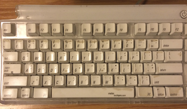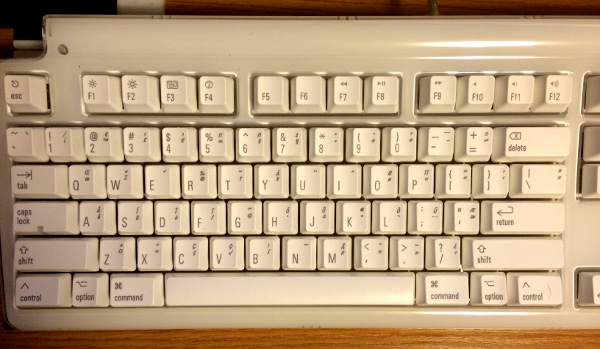

(Click for larger version)
This is a new Matias Tactile Pro keyboard.
Take a look at the letters printed on the key caps. Do the verticals look vertical? The vertical strokes on the I, the U, the J, the K -- do they look like they're perfectly straight up and down?
Well, guess what. They are. And to you, they look straight.
But not to me. To me, they look distinctly tilted to the left. But only if the image is in the bottom half of my field of vision. It's not a strong effect in this photo, but when I look at the actual keyboard -- which I'm typing on right now -- the effect is really strong. All the letters look slanted as hell... until I look straight at one, and then that one looks mostly right.
What the heck?
Here's the thing. For the past few years, I've been using this older model of Matias Tactile Pro:
(Click for larger version)
As you can see, it's well-used and disgusting. Before this, I used another of the same model. And another before that. I've been using this model of keyboard since about 2004. Obviously, the key caps on these older keyboards were printed in italics. (Matching the style of Apple's Mac keyboards up until 2007-ish.)
So for ten years, I've had these italic letters in the bottom of my field of vision -- just about every day. And now they're not italic any more.
The vertical letters look back-slanted to me. It's been several hours, and they still look back-slanted.
Brains, man. What the hell.
Update, Jan 23: The effect has almost completely worn off.
Thoughts of Days ( <-- Previous and Next --> Thought)