Customized Rubik's Cubes
My friend
Kristin Looney
has developed
Custom
Cube Technology
-- tools for putting new designs on Rubik's Cubes.
I saw a bunch of
her creations.
Immediately, my eyes crossed, my brain started bubbling out my ears,
and I began sketching notes for my own patterns.
Oddmaze
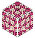
Plan #1 is a maze; or rather a labyrinth, since there are no branches
or dead ends.
 (link to 100K GIF)
Photograph (link to 38K JPEG)
Note that each face has a different symbol in the center, and
the symbols are orientable -- you can tell which way is up. (The small
"Z" signature on each face also helps orient the faces.)
The patterns look random, and to a certain extent they are. But I did
give some thought to the layout. There are six possible edge patterns,
and each one appears exactly twice. There are ten possible corner
patterns, but two are mirror images and one has a tiny loop which can
never be joined to any other path; that leaves eight usable distinct
patterns, each of which appears exactly once.
The layout shown above has more nice features. It has the Celtic knotwork
property: when following any path, you always alternate
crossing overpasses and underpasses. (The symbol-node at the center of each
face does count as a crossing.) Also, the six pairs of identical edge cubes
are never either on the same face nor exactly antipodal to each other.
There are a number of different challenges with this cube.
- Mix the cube around, then get from one face-symbol to the opposite
face. (You must actually reach the symbol on the path it's on, not the one
that crosses underneath it.) This is actually more likely than not to happen
by pure luck. But if it doesn't, try to create such a path in a few cube
moves as possible.
- Make nice symmetrical patterns on every face. (Probably difficult,
but depends on how aesthetic you want to be.)
- Since there are no branches or dead ends, the paths always form some
number of closed loops. Try to make a loop that crosses every one of the
54 squares at least once.
- Try to move all the paths into a single loop. (Accomplished
by Jake Davenport.)
- Produce the Celtic knotwork property (see above).
This is possible, since I designed it that
way; the pattern shown above has this property. But it's very difficult.
Colorspace
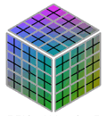
This isn't logically any different from the standard Cube -- except
that the centers of each face have to be oriented correctly. However,
it sure does look cool, doesn't it?
 (link to 80K GIF)
Photograph (link to 35K JPEG)
Necker Cubes
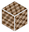
Again, a standard Cube puzzle. Comes with built-in migraine. Each face
has a different arrangement of the three colors (light, medium, dark),
although the patterns (before coloring) are identical.
Then the three colors are made by varying widths of dark brown lines
on light tan. So there's only one solution, but you have to squint to
have any idea what's going on.
 (link to 115K GIF)
Photograph (link to 38K JPEG)
The effect is deliberately reminiscent of an Escher woodcut -- both
in design and shading.
House of Stairs
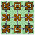
This is another interesting one. The stairs go up and down, through
gaps in the railings and openings in the platforms themselves.
The perspective is rather inconsistent; the stairs appear to slant
the way perspective says they should, but the platforms are all
at the same altitude.
 (link to 108K GIF)
There are two levels of challenge here:
- Make the stairways consistent, so that every one has an "up"
end and a "down" end. Make sure no two "ups" meet at a border,
or two "downs".
- Make the stairways consistent, as above, and also make the entire
cube consistent.
There should be no impossible
loops, where you can go down and down and down and return to your starting
point. This is known to be possible, since I designed the original
pattern to have this property. But there's almost certainly only one
way to do it, and it's probably only possible to reach it by looking at
a diagram of how it should look. (I think this is a flaw; it would be more
fun if it were actually easier, so that you could do it without a diagram.)
The Cube of Quendor
This is pure nostalgia. Each face has a segment of the map from
one of six Infocom games (Zork 1, Zork 2, Zork 3, Sorcerer, Spellbreaker,
and Beyond Zork). Significant features of the landscapes are
represented. You may also note the compass, the brass
lantern, and the rare Quendorian Compass Rose.
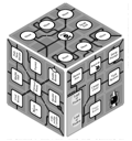 (link to 221K GIF)
The idea for this comes, obviously, from
my own obsession with text adventures.
The paths don't match up between the faces, which is rather a pity.
I was choosing map pieces to be individually appropriate -- not to
fit together. (This flaw is fixed in the Colossal Cube, which is
shown below.)
All these games are in print from
Activision,
on their Classic Text Adventure Masterpieces of Infocom
collection CD (for Mac and PC).
In addition, Zork 1, 2, and 3 can be downloaded
for free from Activision's web site (Win95 only).
I think they're at
ftp://ftp.activision.com/activision/zork1/demo/,
and similarly
zork2
and
zork3;
or possibly
ftp://ftp.activision.com/zork/legacy/.
But I haven't been able to get in to check.
"Listen"
An experiment in blank verse. Or, if you prefer, refrigerator-magnet
poetry.
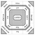 (link to 69K GIF)
The outer bands, in the original configuration, read:
- Alice fell through the hole, but never feared what was there;
- we all leaped up to the stars, and got lost in the void beyond;
- they crawled out of the sea, and we fled from the sight weeping;
- I turned from their eyes, for I never knew the burden bound there;
- you and I ran towards the way out, but could not see what lay ahead;
- no one waited for the end, but all fell to their fate at last;
And the inner bands read:
- sing these words but tell them true and
- twist my ideas to make them clear and
- take six poems and turn them round but
- shut your eyes and hear my hopes and
- take no paths but see all ways and
- spare those pains and mean these ends and
As you see, the lines lack capital letters and final punctuation,
so each one loops forever.
The sentence structures are parallel, so swapping
around analogous parts of different faces gives grammatical
results (I won't go so far as to say "meaningful". Heh.)
Unfortunately, the group of cube rotations does more than
swapping analogous parts. A scrambled cube is generally
nonsensical. The challenge is to make one or all sides
read nicely. This is as difficult or easy as suits your
sense of poetic obscurity.
Earthcubes
Once upon a time, in a high school far far away -- Walter Johnson H.S.
in Rockville, I believe -- I saw these
twelve posters
hanging on a classroom wall. Each showed a fantastical distortion of
the Earth, along with a gnomic phrase.
"What if the Earth were...
Toroidal?
The North Pole coalesces on the South Pole at the inner
equator for achieving ultimate cool."
These Earthshapes were designed by Joseph N. Portney. I finally
found them on
this web site (now defunct);
and I thought, well, hey, twelve of them. So I made two cubes.
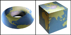
(The Earthshapes are copyrighted by Litton Systems, Inc. The
Terms of Use on their old web site said:
"Material displayed on the Site may be downloaded for non-commercial,
personal use only, provided you also retain all copyright and other
proprietary notices contained on the materials."
Those are the terms under which I created these cube patterns.)
The Colossal Cube
Companion to the Cube of Quendor. This is a single contiguous
segment of the Colossal Cave map, wrapped around all six faces.
It was, you should pardon the expression, a bear to design. (I
sketched six or eight combinations of map variations before I
settled on this one.)
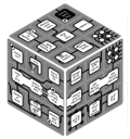 (link to 243K GIF)
(or 2Mb PNG)
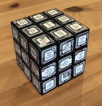 Photograph 1(link to 403K JPEG),
photograph 2 (link to 430K JPEG)
The detail is a little fuzzy on the image on this page. But if
you look carefully, you can find three living creatures, nine
treasures, two signs, a mirror, two chasms, a crack barely
wide enough to squeeze through, and a twisty maze of passages,
all different.
The map is almost perfectly correct, as far as it extends.
One path is shown going east
from a room instead of down, but that's the single error. You'll note
that I had to rotate a few squares to make their paths match up.
The twisty maze is also rather stylized, but it is
topologically correct; eleven rooms all connected to each other,
except for the dead end with the battery vending machine.
Three magic words could have been noted on the cube, but I couldn't
think of a really good representation, and then I forgot. Oops.
Much more information about Colossal Cave can be found on
Rick Adams's
Colossal Cave Adventure Page.
Liquid Crystal Cube
I pretty much got out of the custom-cube business last year (1998), because
I moved away from DC and couldn't use Kristin's die-cutting jig every week.
But I had this one evil thought, and it was worth going to DC just to make
the cubes. (Well, also to visit people.)
The thought is simple: Go look in an
Edmund Scientific
catalog. They sell thermosensitive liquid-crystal sheet -- the
stuff that changes color when it gets warm.
They sell six different grades of it. Each grade changes color (black
to red to green to blue) in a different temperature range.
The lowest is greenish at room temperature; the highest doesn't
change color unless you hold it near a light bulb.
Enough said?
Earthshapes were created by Joseph Portney and are
copyrighted by Litton Systems, Inc.
The other cube patterns and the diagrams of them on this page
were created by me.
They are copyright 1998-9 by Andrew Plotkin.
The photographs of the completed cubes were taken by
Andy Looney.
They are used here by permission.
Last updated February 16, 2023.
Zarfhome
(map)
(down)
 (link to 100K GIF)

 (link to 243K GIF)
(or 2Mb PNG)
 Photograph 1(link to 403K JPEG),
photograph 2 (link to 430K JPEG)