Uru Live: Ercana Pellet Graphs
Information gathered by the Uru community on the efficiency of different
settings on the Ercana pellet ovens.
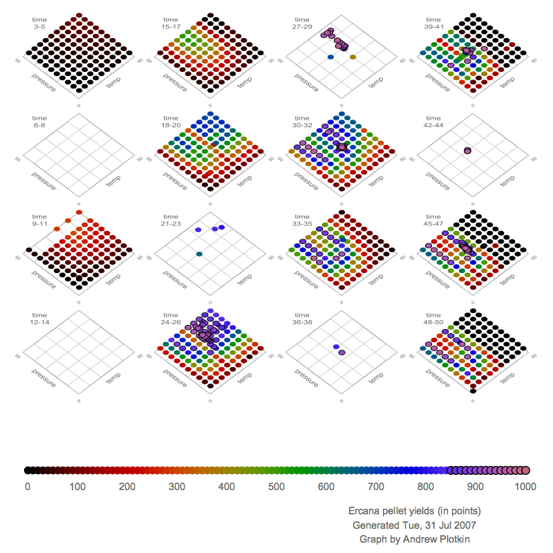
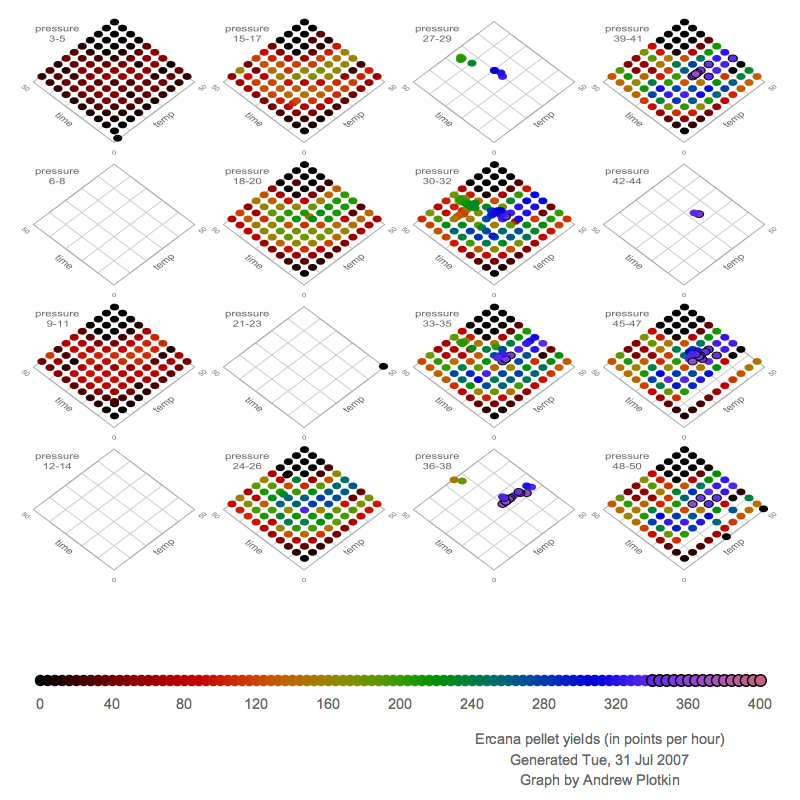
Pellet Yields, in Points
These two graphs simply show the average yield per pellet, for
different (time, pressure, temperature) settings. The two graphs show
the same data, but rotated differently. (Or sliced differently, if you
like.) The first graphs time versus temperature for a given pressure
level, and the second graphs pressure versus temperature for a given time.
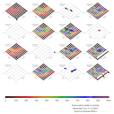
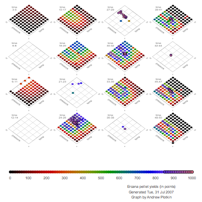
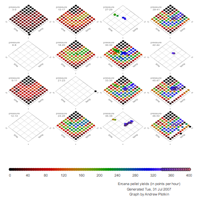
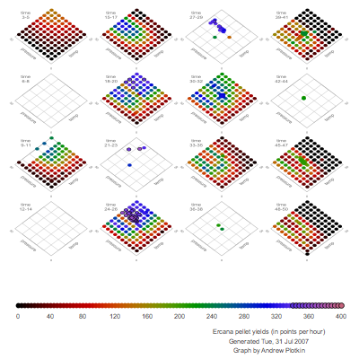
Pellet Yields, in Points per Hour
The next two graphs show the same test results, but the colors represent
efficiency (points per hour) rather than just points per pellet. If you
were running your ovens 24 hours a day, you'd want to use the recipe
with the highest points per hour. You can see that the low-time points
are blue-shifted, and the high-time points are red-shifted, compared
to the first pair of graphs.
(These graphs assume a six-minute overhead time, on top of the
actual baking cycle, for setting the ovens and delivering the pellets.)
Details
All data are for pellets produced with all four ovens at identical
settings.
Where multiple samples are available for a setting, I show the average.
If three or more samples are available, I discard the highest and lowest;
this cleans up some experimental error.
Each graph squashes a few pressure (or time) values together -- otherwise
I would have had fifty little graphs per page, instead of sixteen. So
the first graph at the top shows all the samples with pressure equal to
3, 4, or 5. The values don't seem to vary much at that granularity, so
the views should still be meaningful.
Sources
Last updated July 31, 2007.
More creative Uru work
Other Uru stuff
Zarfhome