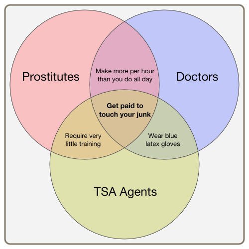

(I've redrawn it, because, seriously, who does a line diagram as JPEG? Original here.)
People have been passing it around as "Venn diagram of the day", which is sad, because it didn't show up on Monday. I first saw it last Thursday, pointed out by this Reddit link. The original image, as far as I know, is an imgur upload with no attribution at all. (Unless it was Reddit user likepeterose? I can't tell. If you know who created this thing, please throw me a tweet.)
At any rate, now it's been linked by Gruber and Chart Porn and Huffington and Laughing Squid and probably other places but I'm tired of Google for a few seconds. Like I said, it's sad, and one reason is that the joke is funny but it fails to get at the real problem with this whole TSA nonsense, which is that it's nonsense. It serves no purpose except to make air travel slower and more uncomfortable.
But the true sadness is that this image isn't a Venn diagram, as you can easily see:
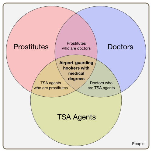
Venn diagrams map out entities. That is, things; in this case, people. A region is a set of people. There may be people in that central area, but I doubt it. (If you are a TSA prostitute with a medical degree, please throw me a tweet.)
(Another sad thing is that nobody, as far as I can find, is referring to this image as "the junkchart chartjunk". Someone should get on that.)
It's clear what the chart's author meant, but he doesn't actually illustrate it. The point is that all three circles are people who get paid to touch your junk. So he really meant something like this:
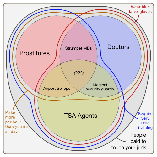
But that's not funny, because it's too complicated. That's the real sad thing. (Aside from the fact that the whole scanning procedure is designed to catch Umar Farouk Abdulmutallab, which is stupid, because Umar Farouk Abdulmutallab is in prison.) Charts should be simple and informative. Jokes should be simple and informative too -- that's what makes them funny. This is why I crack myself up by reading the CIA World Factbook.
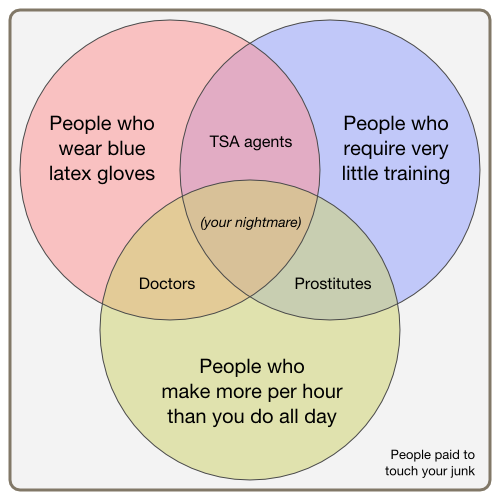
This is better. It's also the inside-out of the original diagram! The entire chart shows people who get paid to touch your junk. The central region is empty, since there are no untrained people getting rich with hands of blue, two by two. I hope.
Ontology to the rescue! What is the original diagram trying to express?
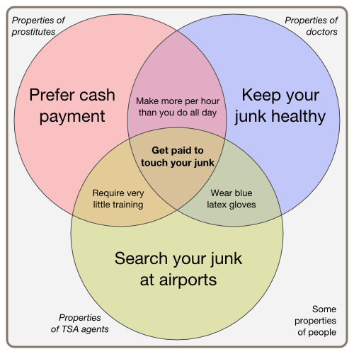
The insight, of course, is that we're no longer mapping people; we're mapping properties that people have. You can think of De Morgan's law. The union of two properties is the intersection of the sets of people who have those properties. (And vice versa.)
Reasoning about properties is much more interesting than reasoning about things. For example:
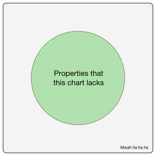
You couldn't do this trick with the previous diagrams. That is, you could, but it wouldn't be paradoxical. The set of people who are represented on a chart and also not represented on the chart is simply the empty set, like the set of single husbands or the set of terrorists who will be caught by the TSA's junk scanners.
But here, we have a Russellian footbiter of a set, like all those non-self-shaving barbers of yore. It's not even defined in terms of people any more. It's pure. You could prove the existence of God with this, although I wouldn't.
I lied earlier, by the way. The new TSA scanners serve a purpose: they make a lot of money for L-3 Communications and Rapiscan. Pronounce that however you like. I'm here for the chartjunk.
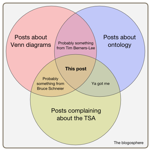
(Update: Fixed the typo in third diagram. Thanks to the folks that pointed it out. Also, here's the Inkscape SVG file containing the diagrams, in case you want to mess with them. You'll have to flip layers on and off in order to see all the variations.)
Thoughts of Days ( <-- Previous and Next --> Thought)